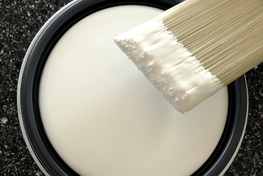
White paint? That's what Benjamin Moore says. Their 2016 color of the year, which has just been released is white. Simply White, to be exact.
This shade of white is soft, comfortable, creamy, and not even a little bit edgy or sharp. Of all of their shades of white – and there are a lot – this one made the cut because, as Ellen O'Neill, Benjamin Moore Creative Director explained to the Washington Post, “it was the most neutral, level and constant in the various light sources used in today's design environments.”
How can you work white paint into your home? It's easier than you think. (Read: Color Trends: Where do They Come From?)
Make White Paint the Perfect Backdrop
No other color besides white, with the possible exception of black, complements so many other colors. It doesn't matter if your heart leaps at the sight of every vibrant hue in the color wheel or you prefer a softer, less shocking environment. Using white as your foundation, your wall color, you can work with any other colors that you like.
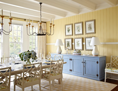
Accessorize using rugs, pillows, draperies, and even furnishings. Go with the contrasting look of dark woods against the white, or aim for the classic white-on-white look weaving in subtle tones of beiges, taupes and creams. With white walls, no color is off limits.
Flip the Design and Accessorize Using White Paint
So maybe white walls seem incredibly boring to you. How can you be on-trend with white for 2016 and still keep your sense of style intact? That's easy. Instead of starting with white, end with it. That way, you can move on ahead when the next trend comes around without needing a new coat of paint. Unless, of course, you want to.
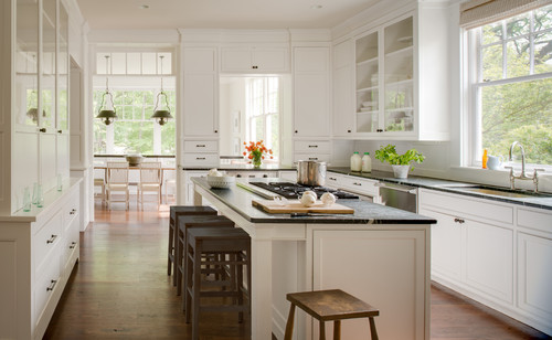
White paint also works on cabinetry, furnishings (think terrific flea market table), picture frames, trim, and doors. Some flooring also readily accepts white paint. If you have old vinyl or a tired wood floor that seriously needs refinishing, perk it up using white paint. Just be sure to use a primer and a durable, non-yellowing sealer.
When White Paint Doesn't Work
Although Simply White was determined to be the most universal, most neutral of all Benjamin Moore whites, there is a potential problem. The size, location and lighting in your home might cause this fresh, white shade to look ugly and flat, or green, yellow or even blue. The only way to know for sure is to test it in your home under natural light at different times of the day. You can get a sample from Benjamin Moore to create a much larger swatch than you'd get on a color card.
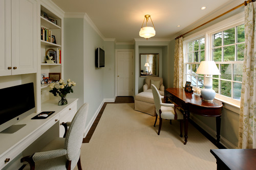
If white won't work, you're not out of luck. You can still follow this light and bright trend using some color. Designer Emily Henderson says that despite the best of intentions, sometimes white just looks all wrong. If that happens to you, try out pale shades of gray, blue, mushroom, beige or grey-green. (Read: Paint Color and Selling Your Home)
White is such a traditional interior color, and so many people, designers included, try to navigate away from it. The conscious choice to name Simply White as color of the year has a lot of pros chattering. But in the words of Benjamin Moore itself, white is complex.
Having trouble deciding what's right for your home? Schedule time with our home expert coach, and you can learn about home improvement, home management, and how to get the very best paint for your own four walls.


Leave a Reply