 Moving trends have changed over the last few years because of the difficulty homeowners have had (or expect to have) selling their homes. Did you decide to stay in your home until the housing market improves and wonder what others are doing?
With so many real estate stories in the news, digging out some facts and figures seemed appropriate. The caution though is … real estate is very local, so US census data gives you the big picture but you need to research your local market (town and neighborhood) as there can be significant variations in prices and inventory (houses for sale) turnover.
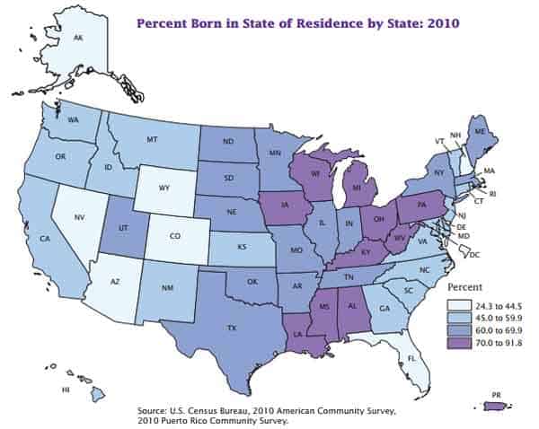
Many of our homeowner dreams come from where we grew up — our parents home, the community where we went to school, etc. That's confirmed by the map below showing Americans who still live in the state where they were born and you might find some surprises. Yikes, New Hampshire (where I've lived for more than 10 years) is one of six states in the US with the lowest percentage of residents born in New Hampshire.
Moving Facts: Who's Moving the Most
Since the 1970 census, American mobility has ranged from a high of 46.4% (from 1975 to 1980) to a low of 35.4% in the most recent census covering 2005 to 2010. Income appears to have less influence on how often we move although marital status does show very different numbers with those separated having the highest rates (51.6%).
- Age – is a major factor in moving patterns, with 65.5% of young people in their mid to late 20s, moving in a 5 year period as they are tying to decide where to settle down.
- Race – also seems to affect how frequently we move with whites moving less 33.7%) than non-whites with moving rates just over 40% (Hispanic, Asian or Black).
- Home ownership – provides significant stability with only 22.2% of homeowners moving in a 5 year period compared to renters moving 65.6%.
- Education – might have some impact on how often we move but not as much as other factors, with moving rates ranging from 30% to 35.6% for those with bachelor's degrees.
- Marital status shows significant variation in moving rates. Widows move the least (18.1%) followed by married households where only 28.8% moved between 2005 and 2010. Groups with much higher moving rates are those divorced (40.1%), never married (44.2%) and separated (51.6%).
- Household income – has some variation with the most stable group earning over $100,000 a year (28.7%). Those earning under $50,000 showed slightly more than one-third (35%) moving while 31% of those earning between $50,000 and $100,000 moved in the same 5 year period.
- Employment status – showed high mover rates for military families (72.7%) and the unemployed (47.7%).
Moving Facts: How Far & Where Do We Move
Between 2005 and 2010, only the south had significant population growth with 1.1 million due to moving. Most of the movement came from the northeast and midwest while the west part of the US is fairly stable.
- Renters when they move tend to stay in the same county (40.7% between 2005 and 2010) versus homeowners who move further, with only 13.2% remaining in the same county.
Moving Facts and Figures
Wondering who collects all this information about how often we move and more? The US United States census has included questions since 1940, beginning with the simple questions “where did you live 5 years ago?”
- US Census Bureau December 2012, Geographical Mobility 2005 to 2010
- US Census Bureau December 2012, Lifetime Mobility in the United States: 2010


Leave a Reply